
When I decided to finally undertake the gargantuan task of creating a new layout design for the Desert Colossus, I made one promise to myself that I intend to keep all throughout the design processthat I take into account the opinions and views of the readership and visitors and not just my own point of view. Now, such a statement may seem like a grandiose platitude, but that's no true at all. After all, it's you, the visitor, that will be using this website's new design, perhaps more so than me (at least, on a much different level than me).
As such, at every step of the way I took into consideration the viewpoint of the user and incorporated their opinions in the design process. I started with the Forumgoers, and used their initial criticisms to mold my direction in the designing process. I then took the layout to the wider public, and fished for opinions through the use of a survey. I didn't receive many responses over the two days the survey was up, only 19, but each opinion was key to the making of my decisions.
Below is a table with every number I got and a "results" value for each question asked to gauge the general opinion of those who answered the survey.

As you can see, the average rating for the "Top Stuff" (that is, the top image and links) is 3.68, "Side Links" is 4, "Navigate" is 4.21, and "Overall" is 4.05. Not bad numbers in the least. As you'll see soon in the comments I received, and as is easily ascertained from these numbers, the "Top Stuff" is the most controversial change. Most importantly, a solid majority of 76% think that the new layout is better than the old one.
Here are the comments I received concerning possible improvements to the design and additional comments, and my responses (which are italicized).
I still think that the Colossus should be moved down a little.
I played around with it, and I wasn't a fan of the way it jutted down into the content of the page. I think it's more symmetrical entirely up top.
On the right-sidebar, a small icon, possibly a sprite from a LoZ game, next to each main thing would be good. IE, the compendium might have a book, while Multimedia might have that record player from OoS/TMC.
Also, I think it would be cool to have as an icon next to each games name a picture of link or his head. IE, next to the original LoZ you might have the link sprite, while AoL would have his head, and OoT would have his head sort of a mix between child and adult link.
As well as that, I think you should expand the site into 1024x768 rather than 800x600. I assume most people use that, and when we look at the site we see half a page of content, a quarter of navigation, and a quarter of blank. I think it would be better with 3/4 content, and 1/4 navigation, and putting the ads where the news flash is (and put news flash under that)
I like the sprite idea, though only for the main section links. If I put sprites all over the place it may look kind of gaudy. As to the resolution issue, the reason it is 800x600 still is because (according to my counter) 23% of my visitors use that resolution.
You forgot Navi (this is OOT's Link, isn't it?)! Also, change the LOZ Link to a Gerudo ( it is the Desert Colossus).
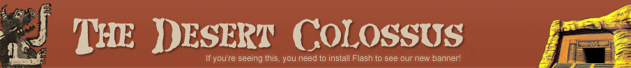
I've represented the desert aspect with the Colossus on the upper left, as well as the desert oasis and Leevers scene. At the same time, I need to pay homage to our hero, Link, as well! And what better Link than one with a candle, whom looks like an explorer in a strange area.
Get rid of the pixelated stuff. it looks stupid. But that's just my opinion...
Well, I'm a fan of the old school/new school contrast. If it's really a giant problem, I'll seriously consider removing it.
Well, I guess you could use more colorful sprites like those from Link to the Past, or possibly even Minish Cap for Link & those things I forgot what they're called.
Very true, but at the same time, I think they may be a little too colorful. I like the Link's Awakening sprites because they use few colors and blend better.
To start off with, I'd suggest a more "zelda-esque" font for the words "desert collossus," as the current font doesn't fit too with the rest of the site's feel. Another thing I think would be good would be (at least) some of the background to be changed at the top, like keep the pyramids but diversify some of the rest of the background without making it seem too cluttered and clashy. Like maybe get a screenshot of Link fighting that Goron or link riding on his horse across a barren landscape from those first two TP trailers- that'd further enhance the "desert feel," I think.
The font that was up before was actually the font from A Link to the Past, haha. But I agree with that assessment, so I reverted to the old, non-pixel font. As for the latter suggestion, I'm not so graphically adept, so my choices are limited in background design. Your decision is interesting, but beyond my abilities.
This is a great lay out! I really like it.
Thanks!
it just looks bad...plain bad
restart and try againOuch...
What happened to the easter eggs? I liked the easter eggs...
They're still there! The Leever's still got something to say, and I added something new to Link.
I am a big fan of using sprites to represent stuff on a website. If I see a book sprite, I know its probably fanfic, or an article, or some sort of written material. If I see a tree stump, I know it referrs to 'the stump'. Good job on the layout. I like it.
I'll definitely experiment with it.
The Banner looks nice but I think it looks cheapo how there are random sprites thrown in, they don't blend...
I'm working on that. Like I said, if it's still an issue, I'll deep-six 'em.
In my opinion, it's mostly the top image that might benefit from some (possibly major) tweaking. The retro look with the background image and the sprites combined isn't as aesthetically pleasing as it could be (i.e. compared to ZeldaBlog's all-sprite or TDC's past sprite-free layouts), and there's something a bit itchy about there being (at the moment) 4 different kinds of pic resolutions in one image (santa hat, Sphinx, background desert, and Link/Leever sprites). A little off-topic here, but are there Sphinxes in the Zelda games?
Things I'd like to see: understanding that it'd be a hassle and that you're also trying to stick with a deserty theme, I think it'd be nice to have an even very slightly different color scheme in the layout, to enhance the wonderful "transformation" feel that a new layout brings. But with that aside, I love the current one, still (very easy to read in all frames)!
Overall, I'd say that the new layout is an improvement on the old one, particularly the sidebar, the "what's hot" bar, and the brown tabs at top (in that order)... I love that you're doing this, even though it's on the bottom of your "to-do" list!
The "sphinx" at the top left of the page is actually a drawing of the Desert Colossus from a published OoT game guide! I'd like to tweak the color scheme, but I really couldn't find a different set of colors I liked as much as the "perfect" scheme from the previous layout. And yeah, I definitely feel that it was important to make this new layout, so I have a clean start. Plus the page really needed to be wider.